Branding
Webdesign
Web development
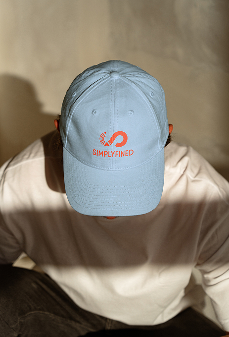
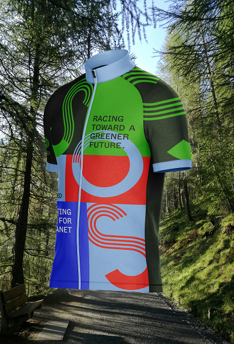
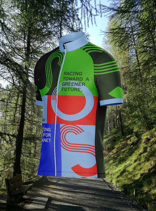
Simplyfined GmbH
We craft the strategic core of your brand—defining its positioning, values, and purpose. With clear narratives and a focused identity, we build brands that are relevant, credible, and built to last.
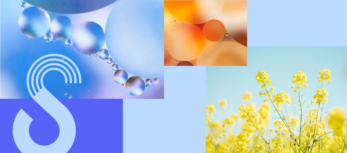
Branding
Webdesign
Web development
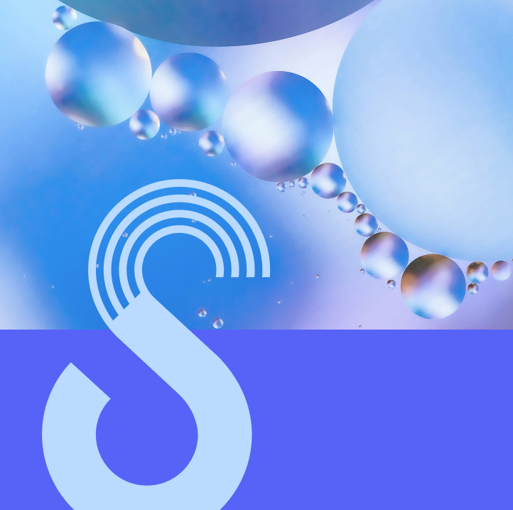
Simplyfined GmbH
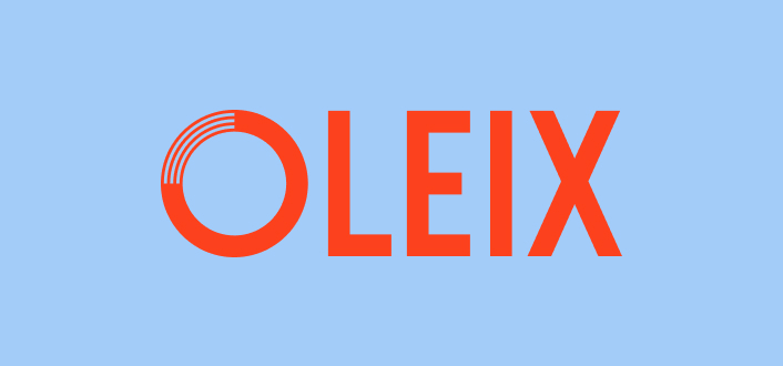
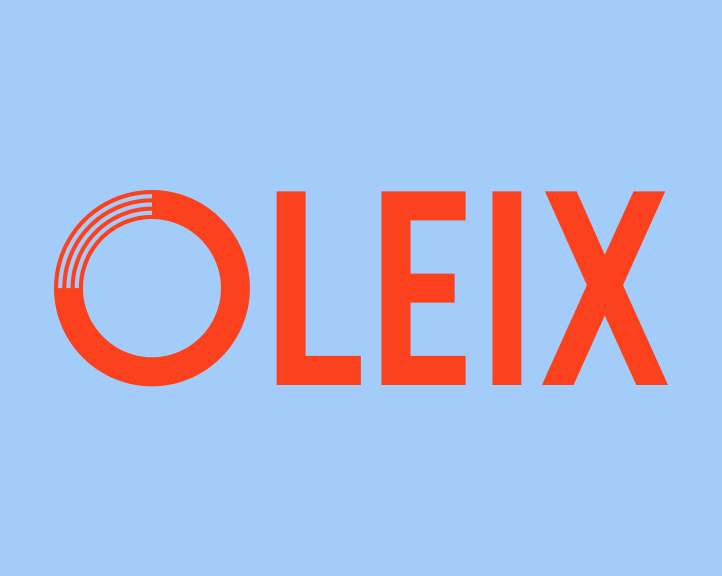
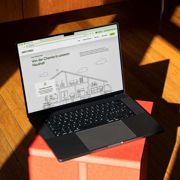
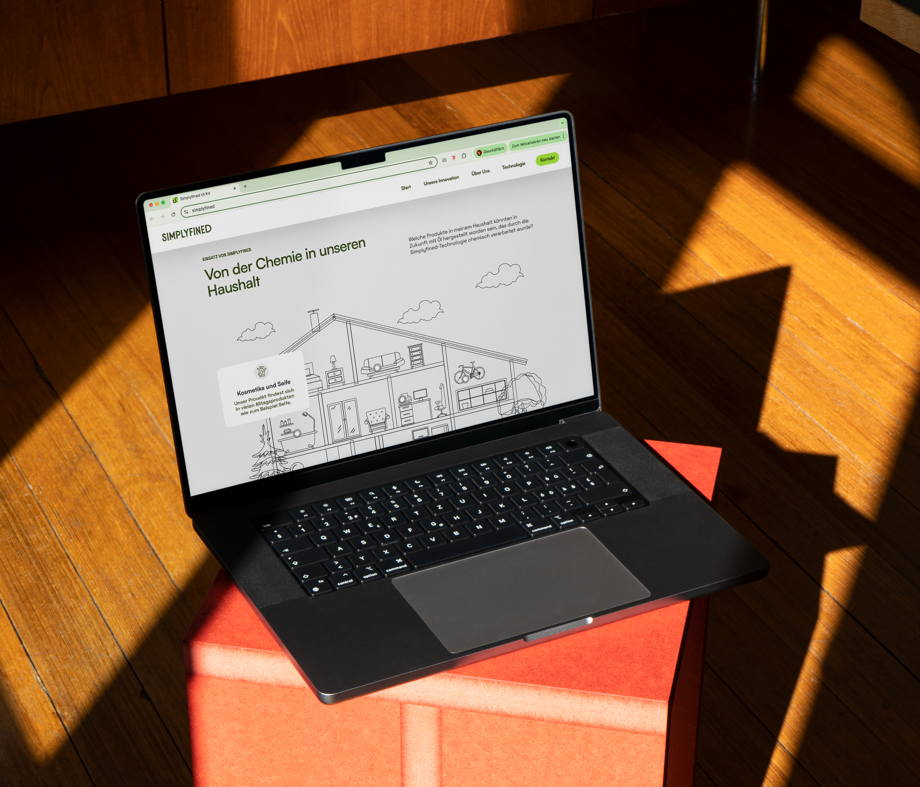
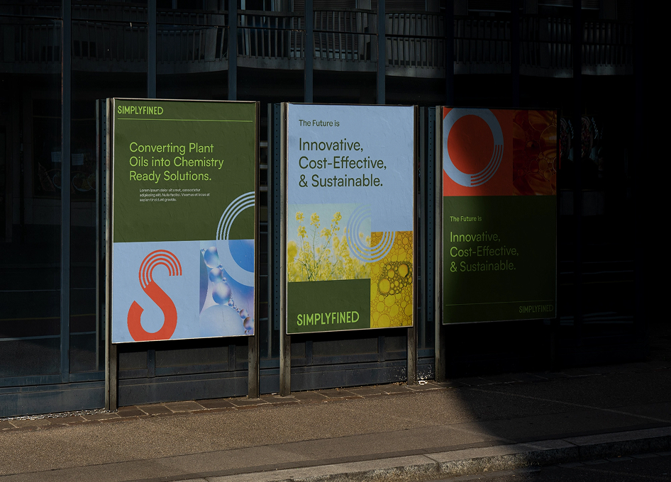
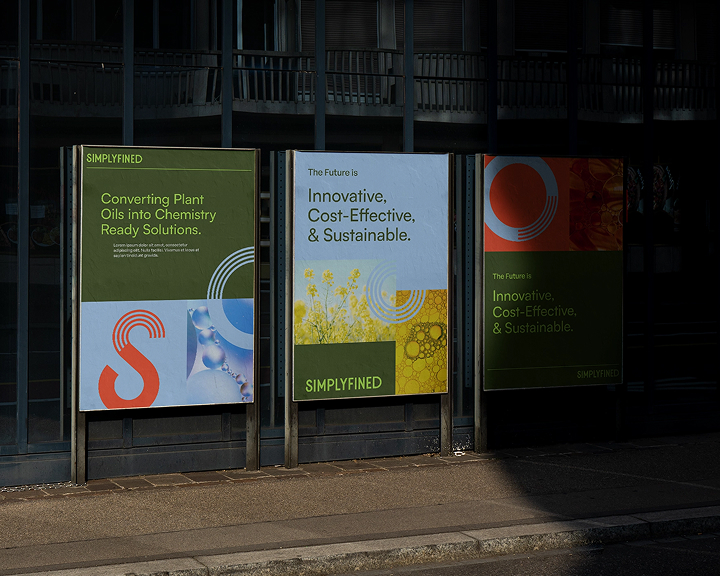
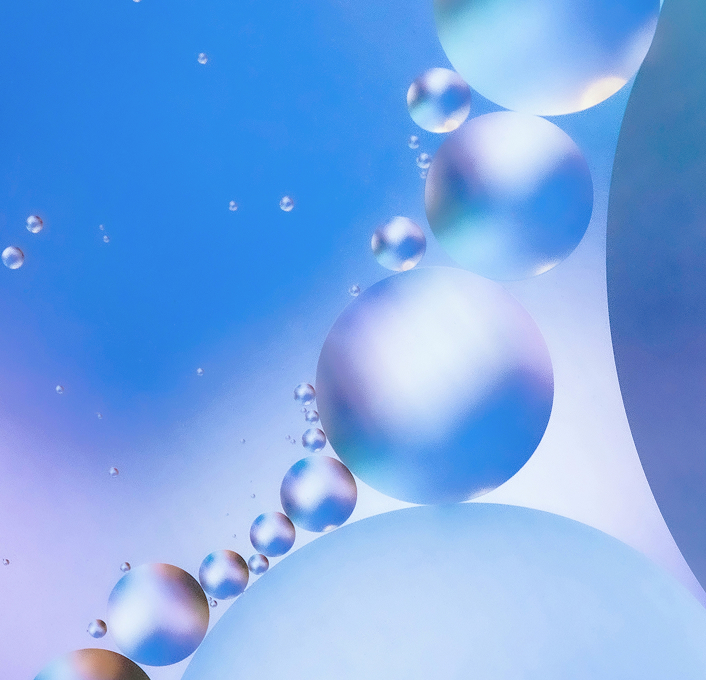
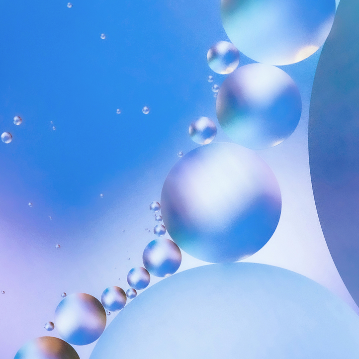
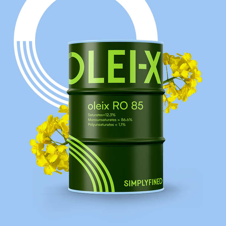
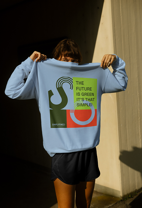
Brand Identity, Webdesign & Development for Simplyfined — a Dortmund-based start-up that has developed a breakthrough technology transforming plant-based oils into high-performance, cost-efficient raw materials, redefining sustainability in the chemical industry.